An Interactive Inequality Map for Baltimore

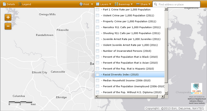
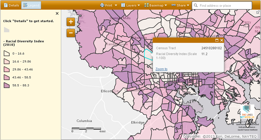
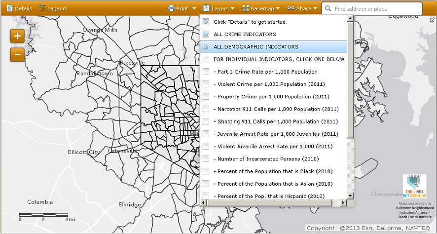
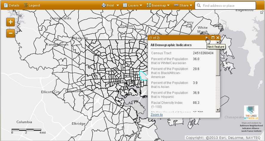
Now you can see all of the "Lines Between Us" inequality indicators in one place.

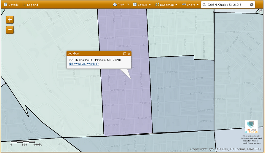
The Baltimore Neighborhood Indicators Alliance built this interactive map at ESRI. You can search by address for indicators, pick one indicator to see how different parts of the region compare, or pick one Census tract and see how it scores on several indicators at once.

Directions are below. Click here to access the map. (It works best in the Google Chrome browser. Please be patient--it takes a bit to load. If you get a message saying the script is slow, let it continue--don't stop the script.)

To view results for one particular indicator across the entire region, click ‘Layers’ and choose an indicator.

A color-coded map will be displayed. Click 'Legend' at top left to define the color codes. Left-click on a Census tract for its exact result.

To display several indicators at once for a particular tract, go to 'Layers,' choose "ALL CRIME INDICATORS" and/or "ALL DEMOGRAPHIC INDICATORS" and/or "ALL EDUCATION INDICATORS."

Left-click on the tract for results, and use the arrow button to toggle between crime, demographic, and education indicators.

To search by address, type the address (including town and state, or at least a ZIP code) in the box at top right. It will locate the address. Then you can choose your indicators and left-click the tract to see the results.