 Is your region doing enough to ensure fair housing? Now the U.S. Department of Housing and Urban Development has a data map to help you find the answer.
The Fair Housing Act requires jurisdictions to "affirmatively further" fair housing, and HUD can withhold federal funding if they don't. How can you tell? Well, jurisdictions have to do an "analysis of impediments" to fair housing. (Here in the Baltimore area, we even have a regional "A.I." report.)
Tomorrow, Sept. 17, is the deadline for public comment on a new HUD rule clarifying what jurisdictions need to do.
To help jurisdictions, HUD has created an interactive fair housing data map (or, if you want to use their jargon, "Prototype Geospatial Tool"). Here's how to use it, and more about the "affirmatively furthering" rule behind it.
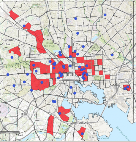
The map starts with Chicago; just zoom out and pan over to see Baltimore. You can see the concentration of housing choice vouchers, public housing, all overlaid by poverty, race, job access, transit access, and other factors. Above right, we've overlaid the location of public housing on what HUD defines as "Racially/Ethnically-Concentrated Areas of Poverty" (in red).
How does the data in these maps compare to the Lines Between Us maps? Take a look.